
Exploratory data analysis in Python
Hello World!!! Here I am with another interesting blog and you can surely guess what it is actually about. Yes, it is about Exploratory Data Analysis (EDA) in Python.
EDA and data mining are closely related, but not the same. In EDA we do a lot of exploration on the data-set and try to get interesting insights from it. Using EDA we can come up with new variables using the existing variables that can be useful to predict more accurate values. In Data mining, we try to find out patterns in the data-set. Using this pattern we can get to know the relationship between variables and use them to improve decision related to business.
EDA is the most important step before modelling a machine learning model. A detailed EDA can bring up important insights, which can improve business. In EDA we try to break down a dataset and represent them visually, so that even a non-technical person can understand what is going on in the business and how it can be improved. Some of the basic steps that needs to be done are:
- Analyse all the variables individually and try to find out if the variable has normal distribution.
- Try to figure out any missing values or outliers and fix them (As discussed in my previous blog)
- Represent the variables graphically and try to find out important patterns.
- Check if the variables have multi-collinearity (More details discussed below).
In this blog I am going to discuss EDA in python using Melborne data-set. Python has a lot of scientific package related to machine learning. Some of the packages that I will be using are Pandas, Numpy, Matplotlib, Scikit-learn and Seaborn. I will try to keep it as simple as possible, but very detailed.
Let us start by importing the required packages and the dataset.
import pandas as pd
import numpy as np
import matplotlib.pyplot as plt
import warnings
warnings.filterwarnings("ignore")
pd.set_option('display.max_columns', None)
original_dataset = pd.read_csv('S:/media/melb_data.csv')
original_dataset.sample(5)| Suburb | Address | Rooms | Type | Price | Method | SellerG | Date | Distance | Postcode | Bedroom2 | Bathroom | Car | Landsize | BuildingArea | YearBuilt | CouncilArea | Lattitude | Longtitude | Regionname | Propertycount | |
|---|---|---|---|---|---|---|---|---|---|---|---|---|---|---|---|---|---|---|---|---|---|
| 1135 | Brighton | 112 Asling St | 4 | h | 2000000.0 | S | Marshall | 25/02/2017 | 11.2 | 3186.0 | 4.0 | 2.0 | 2.0 | 471.0 | NaN | NaN | Bayside | -37.89560 | 145.00370 | Southern Metropolitan | 10579.0 |
| 10375 | Knoxfield | 8 Markhill Pl | 4 | h | 1218000.0 | S | Ray | 27/05/2017 | 23.3 | 3180.0 | 4.0 | 2.0 | 2.0 | 900.0 | 281.0 | 1994.0 | Knox | -37.87695 | 145.25470 | Eastern Metropolitan | 2949.0 |
| 12696 | Coburg | 7 Kewarren Ct | 4 | h | 975000.0 | SP | Nelson | 16/09/2017 | 6.7 | 3058.0 | 4.0 | 2.0 | 2.0 | 301.0 | 209.0 | 2005.0 | NaN | -37.73697 | 144.97568 | Northern Metropolitan | 11204.0 |
| 1021 | Braybrook | 19 Kannan Bvd | 4 | h | 882000.0 | S | Village | 10/12/2016 | 10.8 | 3019.0 | 4.0 | 2.0 | 2.0 | 393.0 | 216.0 | 2008.0 | Maribyrnong | -37.77630 | 144.85430 | Western Metropolitan | 3589.0 |
| 797 | Bentleigh East | 1/41 Elizabeth St | 3 | u | 1025000.0 | S | Woodards | 4/03/2017 | 13.9 | 3165.0 | 3.0 | 2.0 | 2.0 | 384.0 | 120.0 | 1999.0 | Glen Eira | -37.92290 | 145.05570 | Southern Metropolitan | 10969.0 |
I have imported the data-set and displayed 5 random samples from it.Now let me check the dimension of the data-set.
original_dataset.shape(13580, 21)The data-set has 13580 columns and 21 rows. Pandas has a builtin function “describe()” that summarizes the numerical columns in a data-set and tells us about mean, standard deviation, count, etc. This function only considers the numerical columns. So let me use this function and generate a summary about the numerical columns in the data-set.
original_dataset.describe()| Rooms | Price | Distance | Postcode | Bedroom2 | Bathroom | Car | Landsize | BuildingArea | YearBuilt | Lattitude | Longtitude | Propertycount | |
|---|---|---|---|---|---|---|---|---|---|---|---|---|---|
| count | 13580.000000 | 1.358000e+04 | 13580.000000 | 13580.000000 | 13580.000000 | 13580.000000 | 13518.000000 | 13580.000000 | 7130.000000 | 8205.000000 | 13580.000000 | 13580.000000 | 13580.000000 |
| mean | 2.937997 | 1.075684e+06 | 10.137776 | 3105.301915 | 2.914728 | 1.534242 | 1.610075 | 558.416127 | 151.967650 | 1964.684217 | -37.809203 | 144.995216 | 7454.417378 |
| std | 0.955748 | 6.393107e+05 | 5.868725 | 90.676964 | 0.965921 | 0.691712 | 0.962634 | 3990.669241 | 541.014538 | 37.273762 | 0.079260 | 0.103916 | 4378.581772 |
| min | 1.000000 | 8.500000e+04 | 0.000000 | 3000.000000 | 0.000000 | 0.000000 | 0.000000 | 0.000000 | 0.000000 | 1196.000000 | -38.182550 | 144.431810 | 249.000000 |
| 25% | 2.000000 | 6.500000e+05 | 6.100000 | 3044.000000 | 2.000000 | 1.000000 | 1.000000 | 177.000000 | 93.000000 | 1940.000000 | -37.856822 | 144.929600 | 4380.000000 |
| 50% | 3.000000 | 9.030000e+05 | 9.200000 | 3084.000000 | 3.000000 | 1.000000 | 2.000000 | 440.000000 | 126.000000 | 1970.000000 | -37.802355 | 145.000100 | 6555.000000 |
| 75% | 3.000000 | 1.330000e+06 | 13.000000 | 3148.000000 | 3.000000 | 2.000000 | 2.000000 | 651.000000 | 174.000000 | 1999.000000 | -37.756400 | 145.058305 | 10331.000000 |
| max | 10.000000 | 9.000000e+06 | 48.100000 | 3977.000000 | 20.000000 | 8.000000 | 10.000000 | 433014.000000 | 44515.000000 | 2018.000000 | -37.408530 | 145.526350 | 21650.000000 |
From the above table, we can get to know a lot about the numerical columns. The function returns Count, mean, standard deviation, minimum and maximum value in the data-set columns. If we dive deeper, we can understand there are lots of missing values in “Car”, “BuildingArea” and “YearBuilt” columns. I have discussed about handling of missing values in my previous post.
In this data-set, there is “YearBuilt” column and using this I will add another column,”PropertyAge” and use it for further analysis. We will also add another column,”PropertyType” such that any property above 100 years will be considered “Historical” and below will be “Modern”. So lets do that.
original_dataset['PropertyAge']= 2020- original_dataset['YearBuilt']
original_dataset['PropertyType'] = np.where(original_dataset['PropertyAge']>=100,'Historical','Modern')
Let us use the describe() function again, and look at the data-set description
original_dataset.describe()| Rooms | Price | Distance | Postcode | Bedroom2 | Bathroom | Car | Landsize | BuildingArea | YearBuilt | Lattitude | Longtitude | Propertycount | PropertyAge | |
|---|---|---|---|---|---|---|---|---|---|---|---|---|---|---|
| count | 13580.000000 | 1.358000e+04 | 13580.000000 | 13580.000000 | 13580.000000 | 13580.000000 | 13518.000000 | 13580.000000 | 7130.000000 | 8205.000000 | 13580.000000 | 13580.000000 | 13580.000000 | 8205.000000 |
| mean | 2.937997 | 1.075684e+06 | 10.137776 | 3105.301915 | 2.914728 | 1.534242 | 1.610075 | 558.416127 | 151.967650 | 1964.684217 | -37.809203 | 144.995216 | 7454.417378 | 55.315783 |
| std | 0.955748 | 6.393107e+05 | 5.868725 | 90.676964 | 0.965921 | 0.691712 | 0.962634 | 3990.669241 | 541.014538 | 37.273762 | 0.079260 | 0.103916 | 4378.581772 | 37.273762 |
| min | 1.000000 | 8.500000e+04 | 0.000000 | 3000.000000 | 0.000000 | 0.000000 | 0.000000 | 0.000000 | 0.000000 | 1196.000000 | -38.182550 | 144.431810 | 249.000000 | 2.000000 |
| 25% | 2.000000 | 6.500000e+05 | 6.100000 | 3044.000000 | 2.000000 | 1.000000 | 1.000000 | 177.000000 | 93.000000 | 1940.000000 | -37.856822 | 144.929600 | 4380.000000 | 21.000000 |
| 50% | 3.000000 | 9.030000e+05 | 9.200000 | 3084.000000 | 3.000000 | 1.000000 | 2.000000 | 440.000000 | 126.000000 | 1970.000000 | -37.802355 | 145.000100 | 6555.000000 | 50.000000 |
| 75% | 3.000000 | 1.330000e+06 | 13.000000 | 3148.000000 | 3.000000 | 2.000000 | 2.000000 | 651.000000 | 174.000000 | 1999.000000 | -37.756400 | 145.058305 | 10331.000000 | 80.000000 |
| max | 10.000000 | 9.000000e+06 | 48.100000 | 3977.000000 | 20.000000 | 8.000000 | 10.000000 | 433014.000000 | 44515.000000 | 2018.000000 | -37.408530 | 145.526350 | 21650.000000 | 824.000000 |
We can find out the “YearBuilt” column has been considered as numerical, but it is actually categorical. So I will change the data type of this column.
original_dataset['YearBuilt'] = original_dataset['YearBuilt'].astype('category') Now let us look at the data types of the columns using info() function from pandas.
original_dataset.info()<class 'pandas.core.frame.DataFrame'>
RangeIndex: 13580 entries, 0 to 13579
Data columns (total 23 columns):
Suburb 13580 non-null object
Address 13580 non-null object
Rooms 13580 non-null int64
Type 13580 non-null object
Price 13580 non-null float64
Method 13580 non-null object
SellerG 13580 non-null object
Date 13580 non-null object
Distance 13580 non-null float64
Postcode 13580 non-null float64
Bedroom2 13580 non-null float64
Bathroom 13580 non-null float64
Car 13518 non-null float64
Landsize 13580 non-null float64
BuildingArea 7130 non-null float64
YearBuilt 8205 non-null category
CouncilArea 12211 non-null object
Lattitude 13580 non-null float64
Longtitude 13580 non-null float64
Regionname 13580 non-null object
Propertycount 13580 non-null float64
PropertyAge 8205 non-null float64
PropertyType 13580 non-null object
dtypes: category(1), float64(12), int64(1), object(9)
memory usage: 2.3+ MBWe can see “YearBuilt” got converted to categorical. We can understand that the oldest property was built in 1196 and newest in 2018. Let us find out the region where the oldest and newest property is located, along with the price.
original_dataset.loc[(original_dataset['YearBuilt']==1196)|(original_dataset['YearBuilt']==2018),['YearBuilt','Price','Regionname']]| YearBuilt | Price | Regionname | |
|---|---|---|---|
| 1234 | 2018.0 | 1310000.0 | Southern Metropolitan |
| 9968 | 1196.0 | 1200000.0 | Eastern Metropolitan |
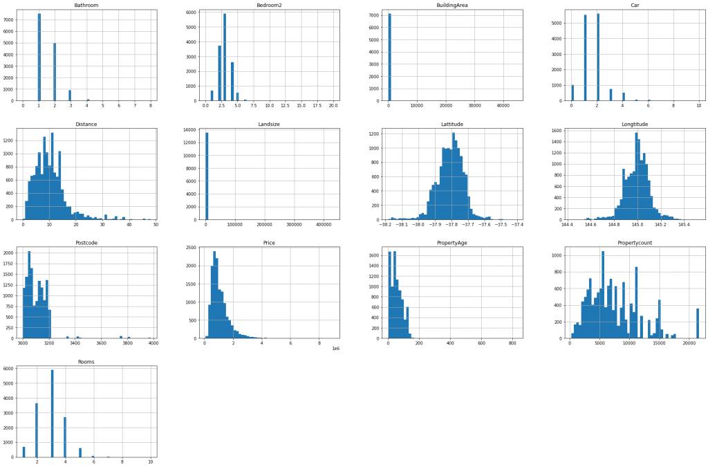
From above we can get to know about the oldest and newest property. Now I will plot histogram and box-plot for all the numerical columns and try to get some insights.
#generate boxplot
original_dataset.select_dtypes(exclude=['object']).boxplot(figsize=(20,10))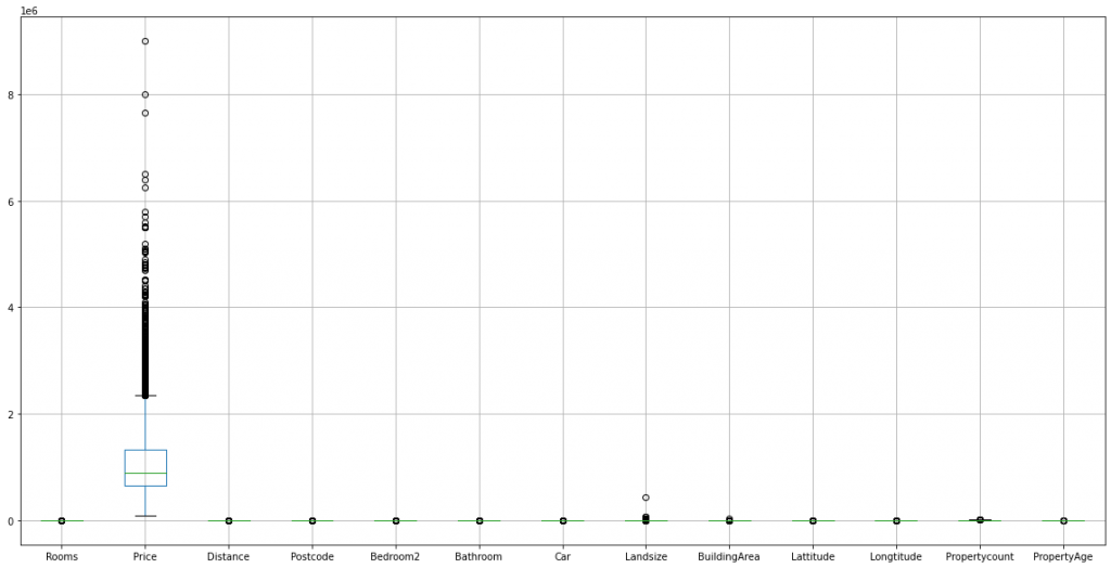
Some of the inference that can be drawn from the above plots are:
- The “Price” column seems to have outliers, as evident from the boxplot. But they are not actually outliers, since it is normal that a rich person has a very expensive house compared to other citizens. From the histogram we can find out that the column is not normally distributed. So, we will apply some transformations and try to make it normal.
- “Rooms”,”Postcode”,”Bedroom2″,”Bathroom”,”Car” and “Propertycount” have discrete values.
Now I will look into the “Price” column with more details and look at the data distribution using the Seaborn package.
import seaborn as sns
sns.distplot(original_dataset['Price'], color='g', bins=100, hist_kws={'alpha': 0.4})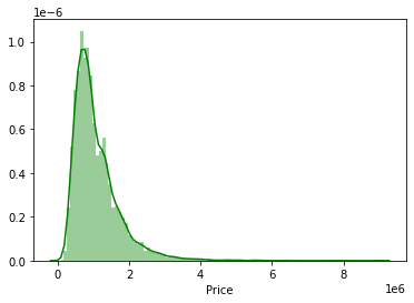
From the figure, we can find out that the distribution is skewed. Lets check the amount of skewness.
original_dataset['Price'].skew()2.239624312529873We can see that the skewness value is positive, that means the data is right-skewed. We will apply a log transform using Numpy and plot the histogram to check whether the skewness can be decreased.
sns.distplot(np.log(original_dataset['Price']), color='g', bins=100, hist_kws={'alpha': 0.4})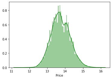
Whoa!!! We can clearly see that the distribution is more symmetrical. So lets check the skewness value.
np.log(original_dataset['Price']).skew()0.18065988655954393We can see the log transform did a magic and the skewness is close to zero, i.e., the log of “Price” is normally distributed.
Let us now check the correlation between the variables. Correlation refers to the fact, whether a column is strongly related to other column, for example if a person is tall, his weight will also be more, than a short person. That means height and weight are correlated. If a column is strongly correlated to other column, we simply drop one of the columns during modelling, since both the columns provides same information, and it may lead to over-fitting. Let us generate a correlation matrix and get some insights.
correlation_matrix = original_dataset.select_dtypes(exclude=['object']).corr()
plt.figure(figsize = (10,10))
sns.heatmap(correlation_matrix, annot=True)
plt.show()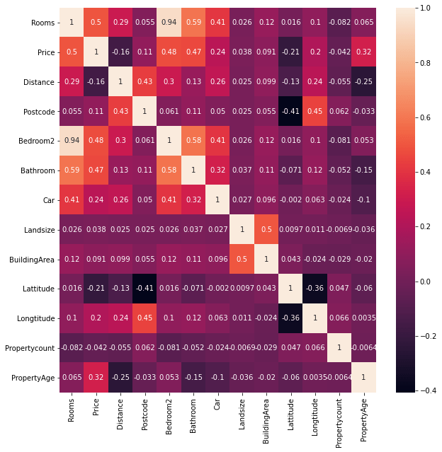
We can get the following interesting insights from the heatmap:
- A strong positive correlation can be observed between “Rooms” and “Bedroom2”. That means an increase in the number of rooms, increases the number of bedroom. So during modelling, we can drop either one of the column.
- There is a positive correlation between “PropertyAge” and “Price”,i.e., if the property is new, the price will be less as compared to older properties.
- There is a positive correlation between “Rooms” and “Price” and we can understand that as the number of rooms increases, the price also increases.
- We can also find a positive correlation between “Car” and “Rooms”. This mean a person having lots of room in his/her property has lots of car, that simply mean the person is rich.
So far we were dealing with the numerical columns and got some meaningful insights from them. Now let us deal with the categorical columns.
categorical_dataset = original_dataset.select_dtypes(include=['object'])
categorical_dataset.sample(5)| Suburb | Address | Type | Method | SellerG | Date | CouncilArea | Regionname | PropertyType | |
|---|---|---|---|---|---|---|---|---|---|
| 845 | Bentleigh East | 37 Orange St | h | S | Buxton | 12/11/2016 | Glen Eira | Southern Metropolitan | Modern |
| 3903 | Malvern East | 1c Wilmot St | t | S | Jellis | 30/07/2016 | Stonnington | Southern Metropolitan | Modern |
| 3087 | Hampton | 1/514 Bluff Rd | t | VB | Buxton | 27/11/2016 | Bayside | Southern Metropolitan | Modern |
| 10121 | Balwyn North | 17 Cityview Rd | h | S | hockingstuart | 27/05/2017 | Boroondara | Southern Metropolitan | Modern |
| 8576 | Ashburton | 11 Poulter St | h | PI | Buxton | 29/04/2017 | Boroondara | Southern Metropolitan | Modern |
Let us now visualize which region has most number of properties
categorical_dataset['Regionname'].value_counts().plot(kind='bar')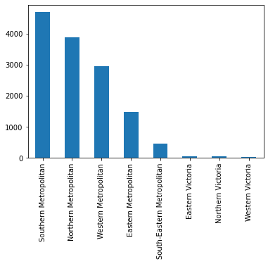
Most of the properties are in Southern Metropolitan, while Western Victoria has the lowest number. Let us now check the average price of properties based on region.
original_dataset.groupby(['Regionname'])['Price'].mean().sort_values(ascending=False)Regionname
Southern Metropolitan 1.372963e+06
Eastern Metropolitan 1.104080e+06
South-Eastern Metropolitan 9.229438e+05
Northern Metropolitan 8.981711e+05
Western Metropolitan 8.664205e+05
Eastern Victoria 6.999808e+05
Northern Victoria 5.948293e+05
Western Victoria 3.975234e+05
Name: Price, dtype: float64We can clearly see that Southern Metropolitan has the highest average property price, but Eastern Metropolitan is second highest in the list. That is quite an interesting finding. That means most of the property in Eastern Metropolitan has high prices, and we can consider this region to have very rich people staying there. Interesting business decision can be taken based on this finding.
We did a lot of EDA and got interesting pattern. Let us now do some feature engineering on categorical columns. In my previous blog I discussed about feature scaling of numerical columns, but did not discuss about handling of categorical features. So let us do that here.
Handling of categorical features
Categorical features cannot be directly applied for modeling. The text features need to be converted to numerical representation. There are 2 main ways to do it, One-hot encoding and Label encoding. As a newbie, one gets confused about using one over the other encoding method. So I will explain when to use one.
One-hot encoding: In this transformation method, a categorical column is converted to multiple column having values of 0 and 1. Let us look at an example using pandas. We will convert “Regionname” column into dummy variables
pd.get_dummies(original_dataset['Regionname'], prefix="Region").sample(5)| Region_Eastern Metropolitan | Region_Eastern Victoria | Region_Northern Metropolitan | Region_Northern Victoria | Region_South-Eastern Metropolitan | Region_Southern Metropolitan | Region_Western Metropolitan | Region_Western Victoria | |
|---|---|---|---|---|---|---|---|---|
| 6202 | 1 | 0 | 0 | 0 | 0 | 0 | 0 | 0 |
| 11589 | 0 | 0 | 0 | 0 | 0 | 1 | 0 | 0 |
| 3955 | 0 | 0 | 0 | 0 | 0 | 0 | 1 | 0 |
| 6231 | 1 | 0 | 0 | 0 | 0 | 0 | 0 | 0 |
| 1347 | 0 | 0 | 1 | 0 | 0 | 0 | 0 | 0 |
We can find out that the categorical column has now got converted to numerical column. Using the same method, we can convert all the categorical columns into dummy variables, concat them together and do our modelling.
Label-Encoding: One other method of encoding is label encoding. This method is generally used when the column is ordinal,i.e., for example, if there is a column named “Rating” and people rate it like “Satisfied”, “Dis-satisfied”, etc. then we can use this. Lets see an example.
We will consider “Type” in the data-set as ordinal and so we will apply label encoding using Scikit-learn package. Before applying label encoding, let us check the number of unique values in “Type” column.
original_dataset['Type'].value_counts()h 9449
u 3017
t 1114
Name: Type, dtype: int64Now let us apply label encoding
from sklearn import preprocessing
label_encoder = preprocessing.LabelEncoder()
encoded = label_encoder.fit_transform(original_dataset['Type'])
encoded = pd.DataFrame(encoded, columns=['Type'])
encoded.sample(5)| Type | |
|---|---|
| 1795 | 0 |
| 3457 | 0 |
| 3518 | 2 |
| 8355 | 2 |
| 231 | 0 |
We can find out that “Type” column has been converted to label encoded data. Lets check the number of unique values and find out whether the encoding is proper.
encoded['Type'].value_counts()0 9449
2 3017
1 1114
Name: Type, dtype: int64Hurray!!! You can see that “h” got converted to 0, “u” to 2 and “t” to 1 with same number of values. So we can conclude, the encoding is proper.
Let us now visualize the number of “Historical” and “Modern” properties and get some insights.
original_dataset['PropertyType'].value_counts().plot(kind='bar')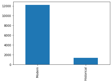
There are very few Historical properties as compared to Modern properties. Now let us find out average price between two kind of properties.
original_dataset.groupby(['PropertyType'])['Price'].mean()PropertyType
Historical 1.545792e+06
Modern 1.023792e+06
Name: Price, dtype: float64We can understand that the Historical properties are costlier than the modern properties, as we have inferred earlier.
Final thoughts – Exploratory Data Analysis in Python
In this blog I tried to explain in detail about EDA in Python and got some really meaningful insights. We can keep on exploring the data-set and make our analysis more detailed. I will ask my readers to do further analysis on the data-set and let me know about some cool findings. In my next blog, I am going to discuss about Logistic regression in Python and build a classification model from scratch. Please stay tuned for further updates.


